CostGraph
Designing a clearer way for infrastructure teams to understand and act on cloud costs.
Cloud cost management isn't short on data. If anything, teams have too much of it. We started CostGraph with a simple question:
How do we help infrastructure teams understand what requires their attention without asking them to interpret another dashboard full of metrics?
I joined at an early stage and helped shape the product experience from the ground up, working closely with the founders, engineering and a product designer I managed.
MY ROLE
Founding Product Designer
Scope: Product Strategy · UX Direction · User Research · Competitive Research · Design Direction · Prototyping
Team: Founders · Engineering · Product Designer
Timeline: 2025 - Present
The Challenge
Having the data doesn't always mean knowing what to do with it.
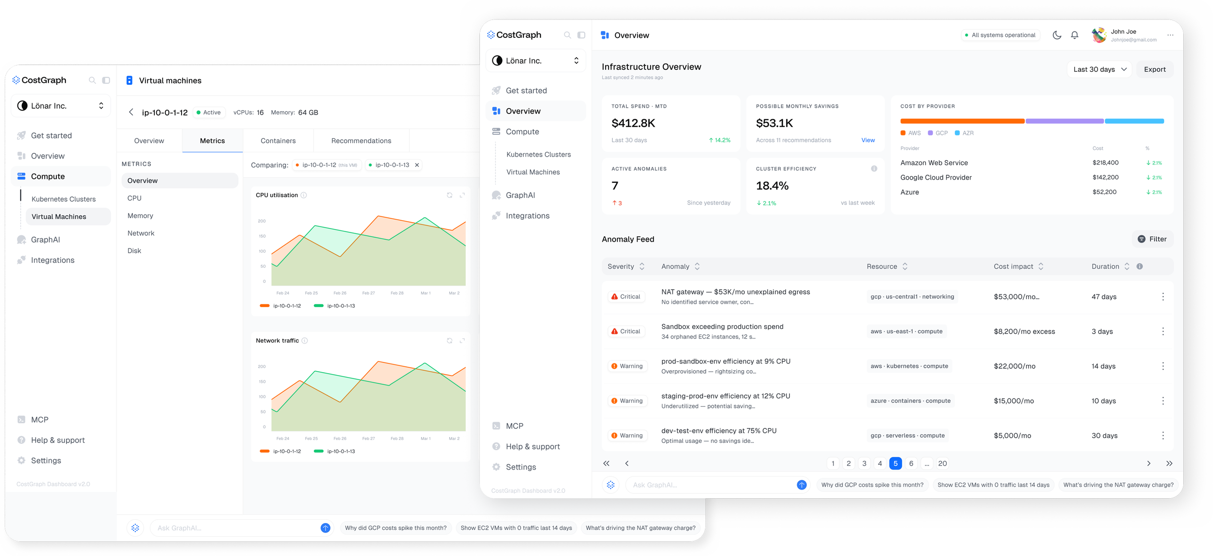
Cloud teams have access to detailed information about their infrastructure: what they're spending, how resources are performing and where costs are changing. But when that information is spread across dashboards, metrics and resources, figuring out what actually needs attention can become another task in itself.
For CostGraph, the opportunity wasn't to give teams more data. It was to make the data they already have easier to understand, prioritize and act on.
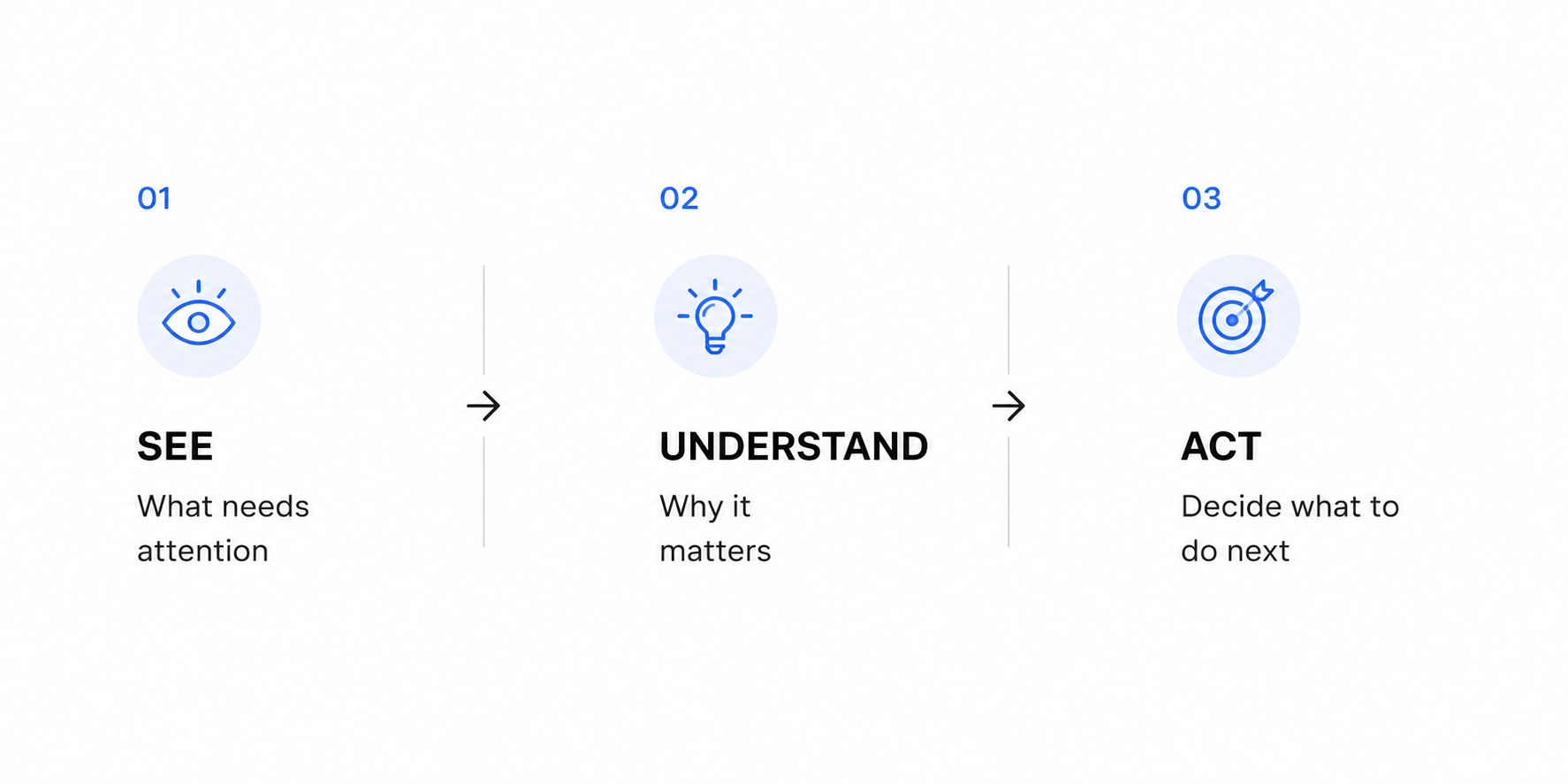
How Might We help teams quickly understand what needs their attention, why it matters and what they can do about it?
Understanding the space
We started off by talking to the users who worked with this data. We spoke to DevOps and infrastructure professionals about the tools they used, how they kept track of cloud spend, what they checked regularly and what frustrated them about the process.
At the same time, we looked at other products in the FinOps space. We compared how they organized information, surfaced recommendations, handled anomalies and were beginning to use AI.
We also spent time defining what we wanted CostGraph to feel like. I created moodboards, explored different visual directions and looked at how we could make something this technical feel clear without stripping away useful detail.
A few things kept coming up:
There was already enough data.
Adding more wasn't going to make the product more useful.It wasn't always obvious what needed attention first.
A dashboard could tell you that something had changed without necessarily helping you understand what to do about it.The numbers needed context.
Spend on its own only tells part of the story. You need to understand the resources behind it before you can make a decision.
These became useful checks for us as we started designing.
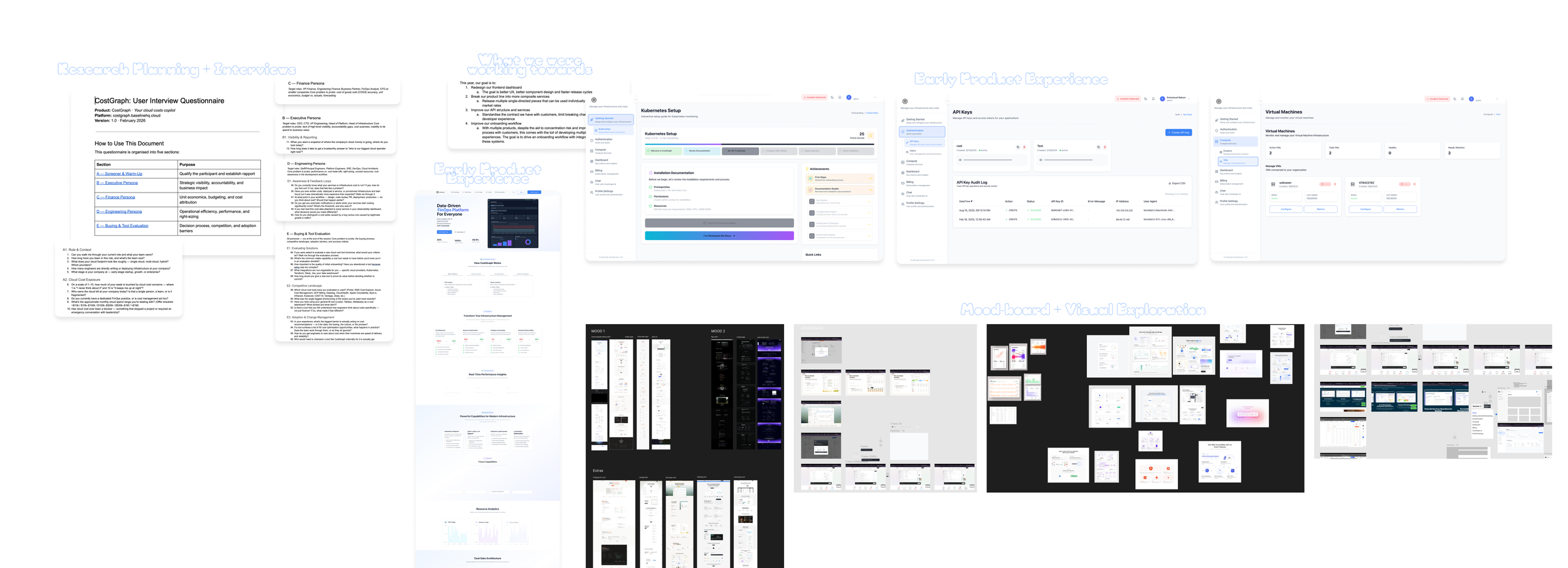
Early CostGraph process: research planning, product goals, early screens and visual exploration.
Shaping the product
One of the biggest decisions we made was not to organize CostGraph around showing as much information as possible.
Designing the hierarchy
A lot of our brainstorming focused on hierarchy across the product: what gets surfaced first, when a recommendation is more useful than another metric and how much context a user needs before they can act.
Working across the product
I worked closely with the founders and engineering on the product direction and with the product designer I managed on how that direction translated into the experience.
We worked across the information architecture, core flows, recommendations, cost reporting and the visual system, testing ideas as the product evolved rather than treating the interface as a final layer at the end.
Designing with real data
Working with real infrastructure data early had a big influence on how we designed CostGraph.
Designing against backend schemas and real infrastructure datasets surfaced edge cases and complexities we wouldn’t have uncovered with static designs alone. It helped us make more informed decisions around information hierarchy, data density, interaction states and how information should be grouped across the experience.
It also gave us a more realistic way to validate our designs, allowing us to see whether the experience still felt clear and usable as the data became more complex.
AI was part of CostGraph from early on. Initially, we approached GraphAI as a feature within the dashboard, a way for users to ask questions about their infrastructure and costs, explore their data and generate insights and visualizations through conversation.
As we spoke with potential customers and investors, our thinking started to shift. One of the opportunities that came up was much earlier in the user journey: could AI help users get set up in the first place?
Connecting infrastructure requires users to identify and add their clusters and VMs during onboarding. Instead of relying entirely on that manual process, we began exploring how GraphAI could help discover those resources automatically and reduce the amount of work required to get started.
That changed how we thought about GraphAI, from a feature within the product to something that could support the experience across the user journey.
We're now exploring how that same thinking can extend beyond onboarding and into other parts of CostGraph, using AI where it can reduce effort, provide context or help users get to what they need faster.
The goal is for GraphAI to feel less like a separate tool users have to go looking for and more like a useful layer within the workflow itself.
Building AI into the workflow: GraphAI
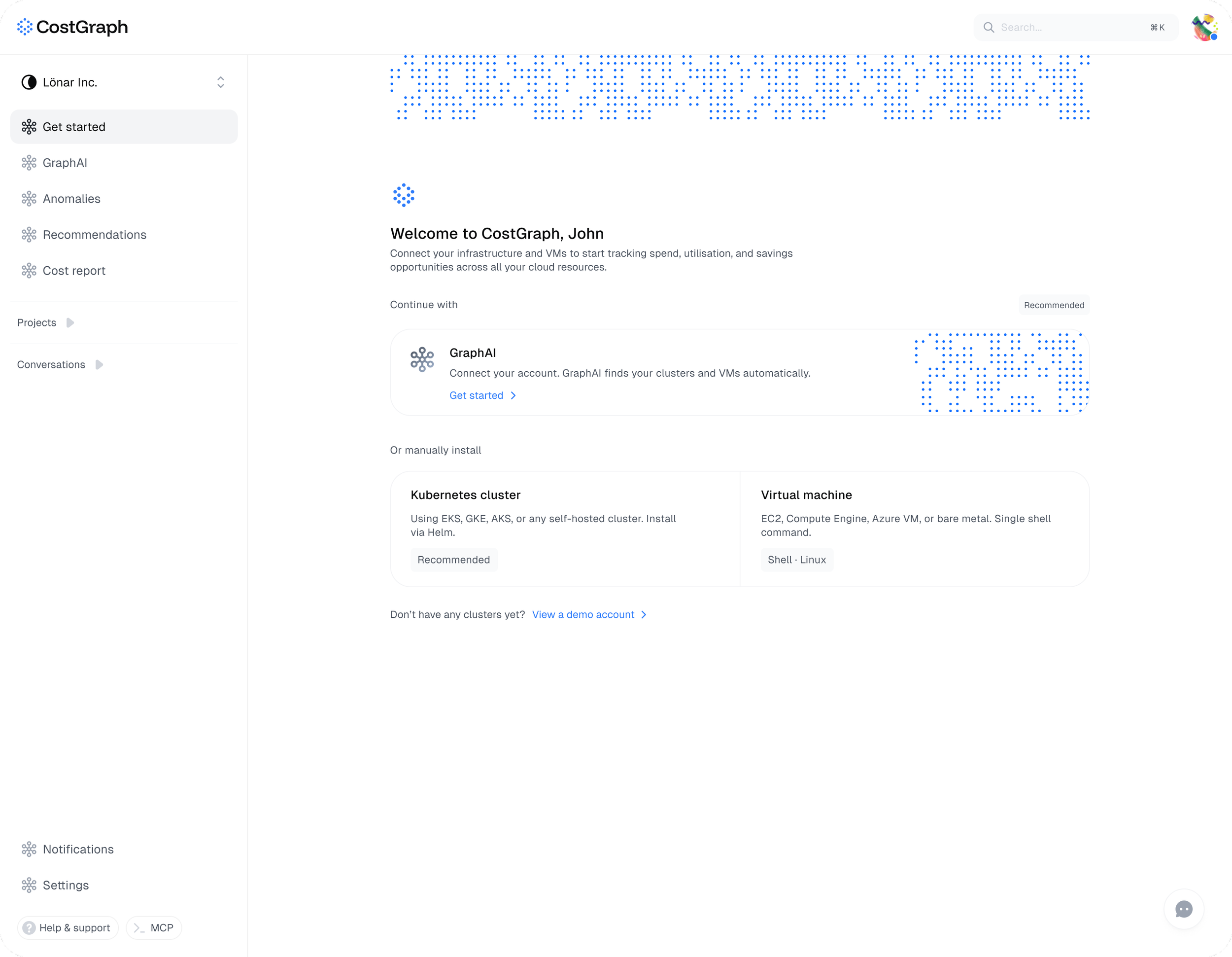
Using GraphAI to reduce the manual work of discovering and connecting infrastructure during onboarding.
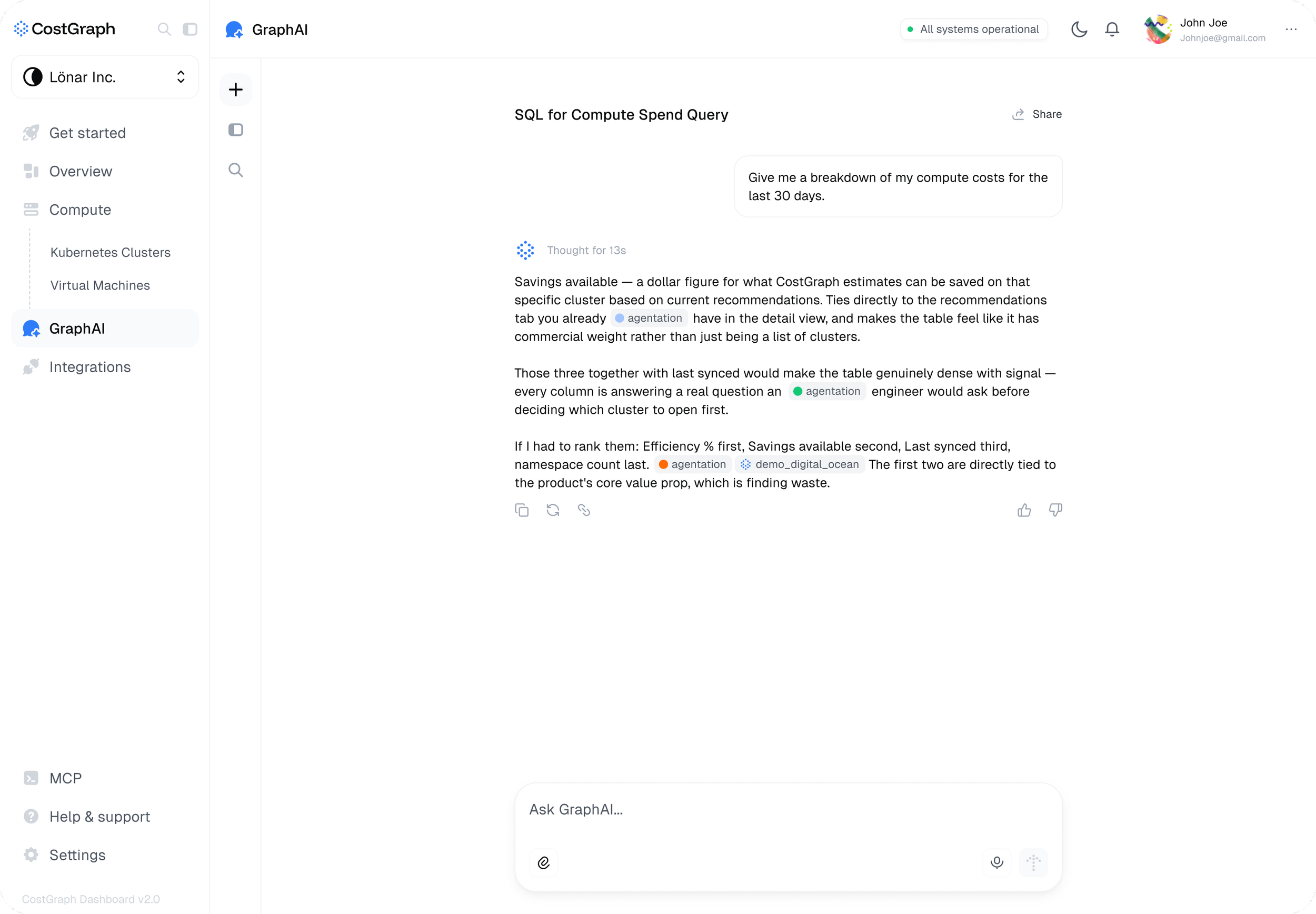
GraphAI beyond onboarding: Once inside CostGraph, users can ask questions about their infrastructure in plain language and explore their data without leaving the workflow.
Working across design and engineering
Because CostGraph was being built from zero, the process was rarely a neat research → design → handoff. We were shaping the product while building it.
My role moved across product and UX direction, research, prototyping, design reviews and working closely with engineering to understand how technical constraints affected the experience.
I also managed the product designer on the team, setting direction, reviewing and shaping the work, while contributing directly to key flows and design decisions.
Working this closely across design and engineering meant we could test ideas, respond to constraints and make decisions quickly as the product evolved.
What I’m learning
CostGraph has changed the way I think about designing technical products.
Making something simpler doesn't always mean showing less. Sometimes it means being much more deliberate about what gets attention first.
Our users already work with complex systems. The goal isn't to hide that complexity, but to organize it in a way that makes information easier to understand and decisions easier to make.
It’s also shaped how I think about AI in products. I’m less interested in adding AI as a separate feature and more interested in how it can understand where someone is in their journey, reduce the work they have to do and help them get to what they need faster.